Pareto Chart
A Pareto chart named after Vilfredo Pareto (an Italian Economist) is actually a bar chart in which all bars are ordered from largest to the smallest along with a line showing the cumulative percentage and count of the bars. The left vertical axis has the frequency of occurrence (number of occurrence), or some other important unit of measure such as cost. The right vertical axis contains the cumulative percentage of the total number of occurrences, or total of the particular unit of measure such as total cost. For Pareto chart the cumulative function is a concave function because bars (representing the reasons) are in decreasing order. Pareto chart are also called a Pareto distribution diagram.
A Pareto chart can be used when the following questions have their answer in “yes”
- Can data be arranged into categories?
- Is the rank of each category important?
Pareto chart are often used with analyzing defects in a manufacturing process or the most frequent reasons for customer complaints to help and determine the types of defects which are most prevalent (important) in a process. So a Company can focus to improve his efforts on particular important areas where it can make the largest gain or the lowest loss by eliminating causes of defects. So its easy to prioritize the problem areas using Pareto charts. The categories in the “tail” of the Pareto chart are called the insignificant factors.
Pareto chart Example
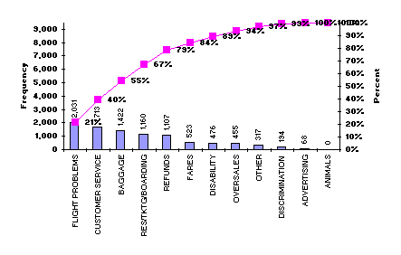
The Pareto chart given above shows the reasons for consumer complaints against an airlines in 2004. Here each bar represents the number (frequency) about each complaint received. The major complaint receive are related to flight problems (such as cancellations, delays and other deviations from schedule). The 2nd largest complaint is about customer service (rude or unhelpful employees, inadequate meals or cabin service, treatment of delayed passengers etc). Flight problems account 21% of the complaints, while both the flight problems and customer service account for 40% of the complaints. The top three complaint categories account for 55% of the complaints. So, to reduce the number of complaints, airlines should need to work on flight delays, customer service, and baggage problems.
References:
- Nancy R. Tague (2004). “Seven Basic Quality Tools”. The Quality Toolbox. Milwaukee, Wisconsin: American Society for Quality. p. 15. Retrieved 2010-02-05.
- http://www.spcforexcel.com/pareto-diagrams-newsletter
- http://en.wikipedia.org/wiki/Pareto_chart
Incoming search terms:
- using a parto graphics diagrams
- Wat is Parento complaint in economics


